What makes a magazine a magazine? In a not-so-distant analogue past, the answer seemed relatively simple: something printed, published at a certain rhythm, whether weekly, monthly, or perhaps only four times a year. Magazines were slower, often dedicated to a specific interest or audience. The term “magazine,” like so many concepts, has its origins in a military context. It can be traced back to the Arabic makhāzin (مخازن), meaning storehouse or depot. The connection to military storage may seem a little absurd today, but the underlying idea remains surprisingly relevant: a magazine is a place to store things.
Taking back control
When we (Anton Rahlwes and Nina Sieverding) started the thing Magazine in 2023, it was a hobby. Coming from the legacy of form magazine, it was an outlet for critical yet inspiring perspectives on design. Instagram seemed like a no-brainer: low maintenance costs, an established infrastructure, and the potential to reach a large audience. And it worked.
Much of the reach and recognition the thing Magazine enjoys today would not have been possible without the platform. But there is another aspect that, to us, makes a magazine a magazine. And that aspect requires independence: journalism.
“But there is another aspect that, to us, makes a magazine a magazine. And that aspect requires independence: journalism.”
Instagram is great as long as you play by its rules. The problem is that those rules are neither particularly transparent nor predictable. The final push to create our own website came when Meta changed its hate speech moderation policies. We realised how dependent we had become on American tech companies as a media platform.
This dependency seemed acceptable when the thing Magazine was just a side project and the US appeared to be a relatively stable democracy. But it becomes much harder to justify when editorial reach might depend on avoiding topics such as queerness, feminism, abortion rights, or racism. So we asked ourselves: What would a the thing Magazine website need today? For us, it came down to two key aspects: independence and accessibility.
Designing backwards
the thing Magazine was never necessarily meant to become a big brand, which made translating its existing visual identity beyond Instagram an unexpected challenge. The task was to develop a design language that would work across different screen sizes, accommodate long-form journalism, and bring together an increasingly diverse range of content. At the same time, we wanted the website to be as accessible as possible within our budget, while reducing our dependence on US-based technology companies wherever we could.
Luckily, we had the support of our friend Max Pietro Hoffmann and his design studio, Autostrada Studios, who put considerably more work into this project than we could ever pay him for. With these challenges in mind, Max began translating the visual language we had developed over the past few years into a wide range of possible directions. We explored different layouts, typographic systems, and ways of organizing information. Sometimes, however, a design process is necessary just to return to where you started.
Together, we realised that the thing Magazine didn’t need a new identity. It needed the identity it had optimised and sharpened for a different medium.
“Together, we realised that the thing Magazine didn’t need a new identity. It needed the identity it had optimised and sharpened for a different medium.”
Take our logo, for instance: Arial Narrow had become an integral part of our visual identity, partly because of its slightly awkward, utilitarian character. Max even connected us with Gregor Maria, who analysed the typeface to explore the possibility of developing a custom version of Arial Narrow for the thing Magazine. Only for us to realise that we actually liked the awkwardness of Arial Narrow and didn’t want to change it. Shout-out to Gregor Maria (Studio) for putting in so much work anyway!
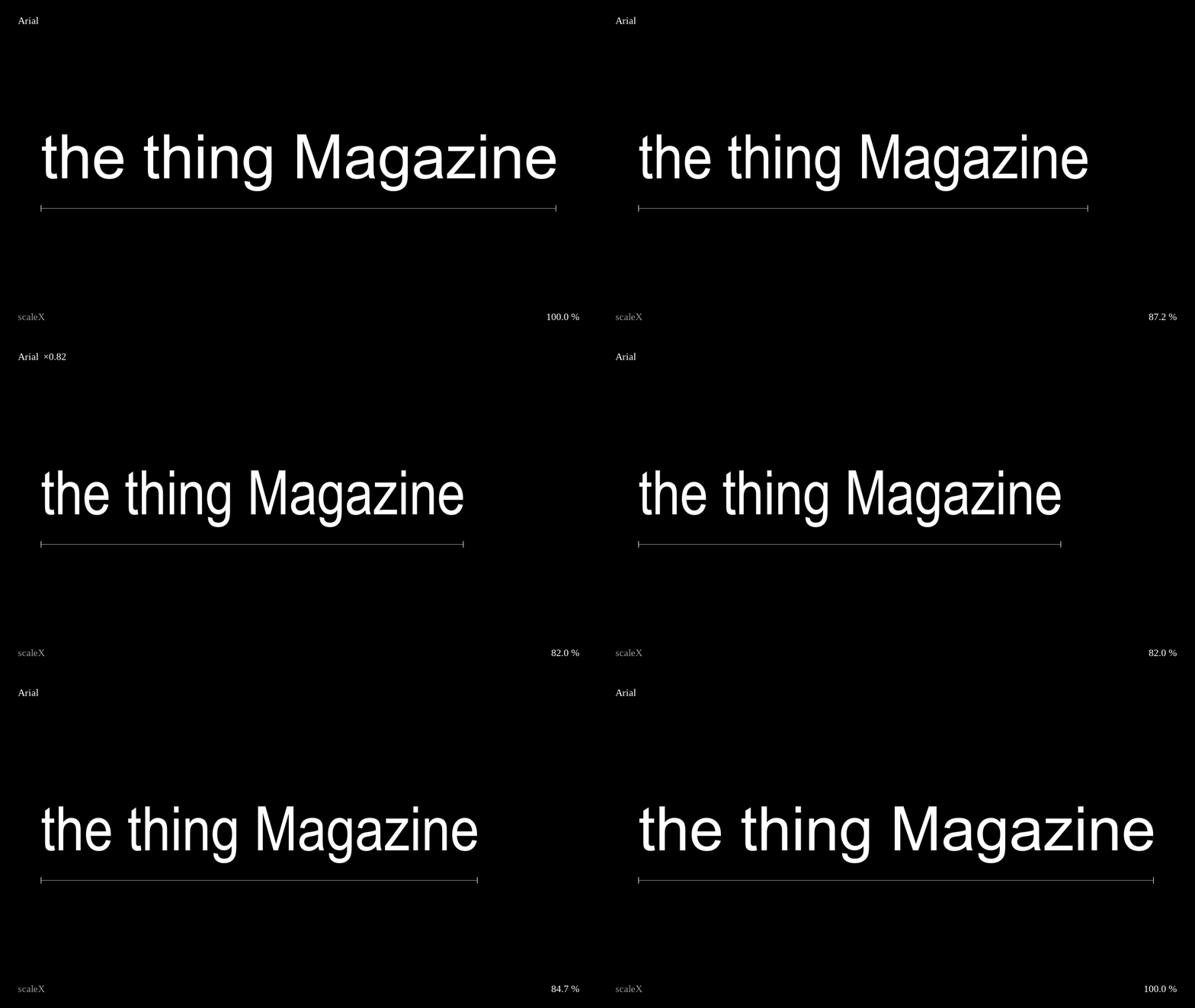
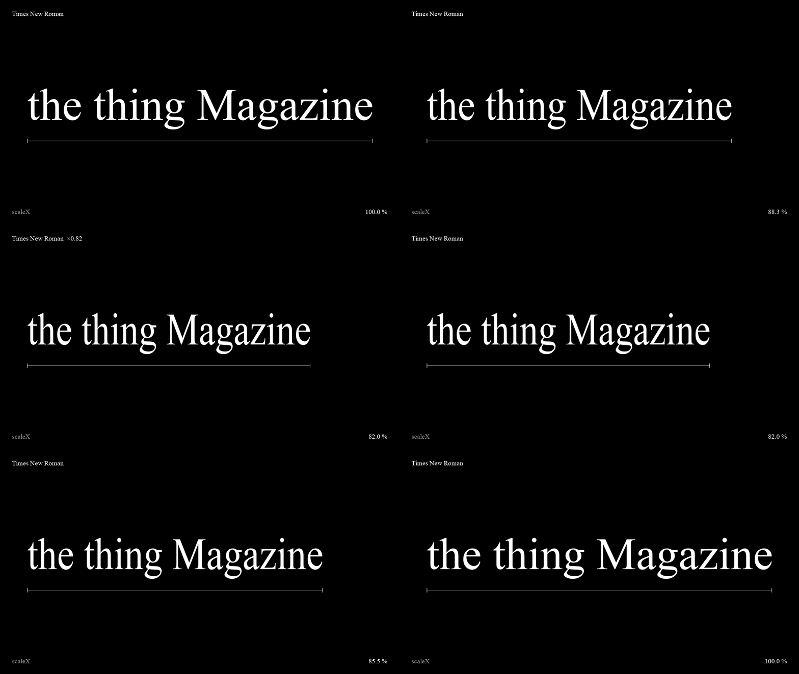
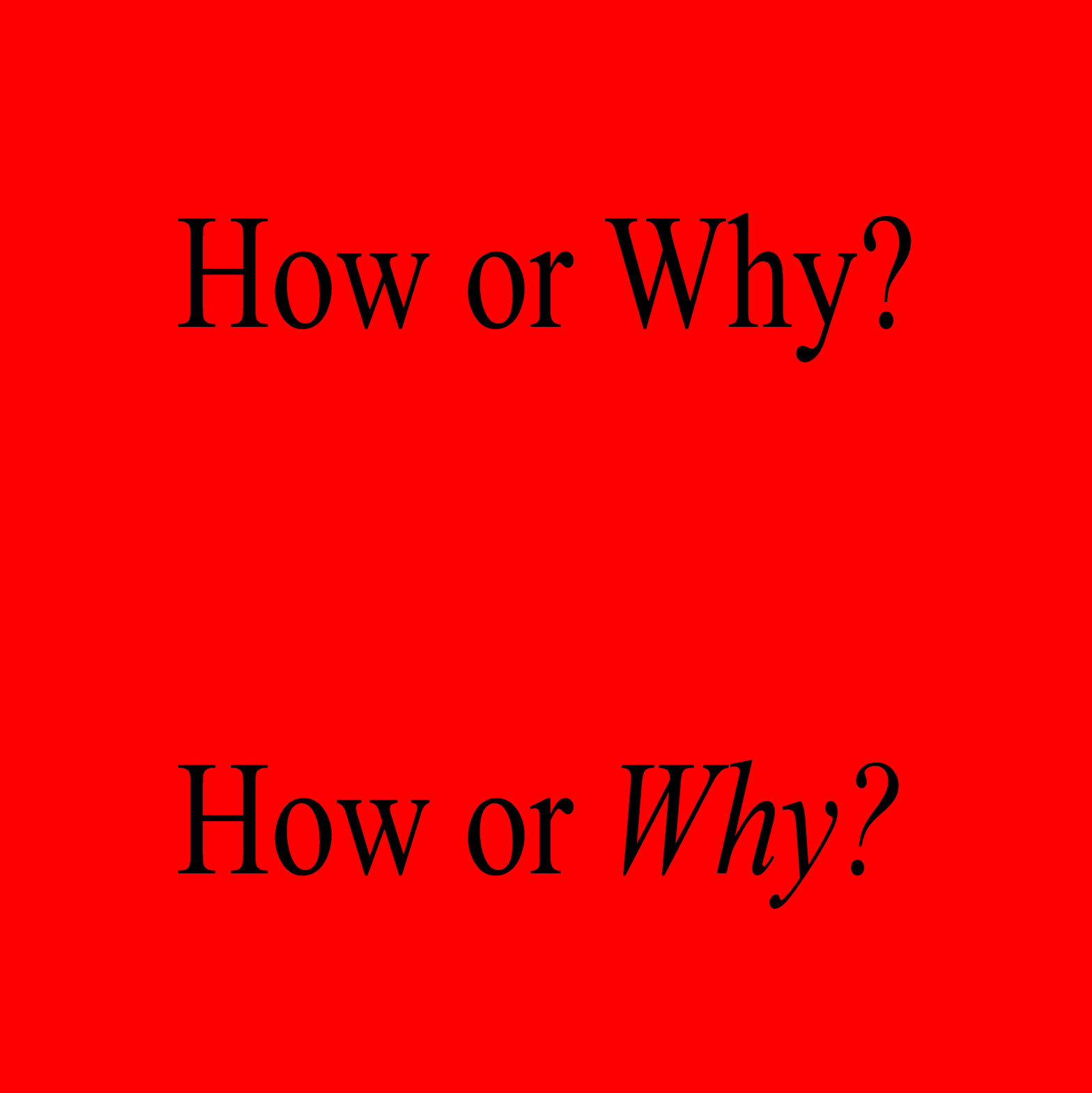
But what works for an Instagram carousel doesn’t necessarily work for a 3,000-word article. Arial Narrow is great for catchy headlines, short statements, and informational layouts. For longer texts, however, it quickly becomes exhausting. We needed something more suitable for extended reading, without introducing an entirely different typographic personality. Following the thing Magazine’s original approach of using simple, readily available tools, we settled on perhaps the most familiar serif typeface imaginable: Times New Roman. It’s classic, highly readable, and, in its own way, almost aggressively unpretentious. We’re basic bitches after all.
For certain headlines, we even created our own makeshift version of Times New Roman Narrow by horizontally compressing the typeface. Not exactly revolutionary type design, but very much in the spirit of the thing.
What really matters: structures
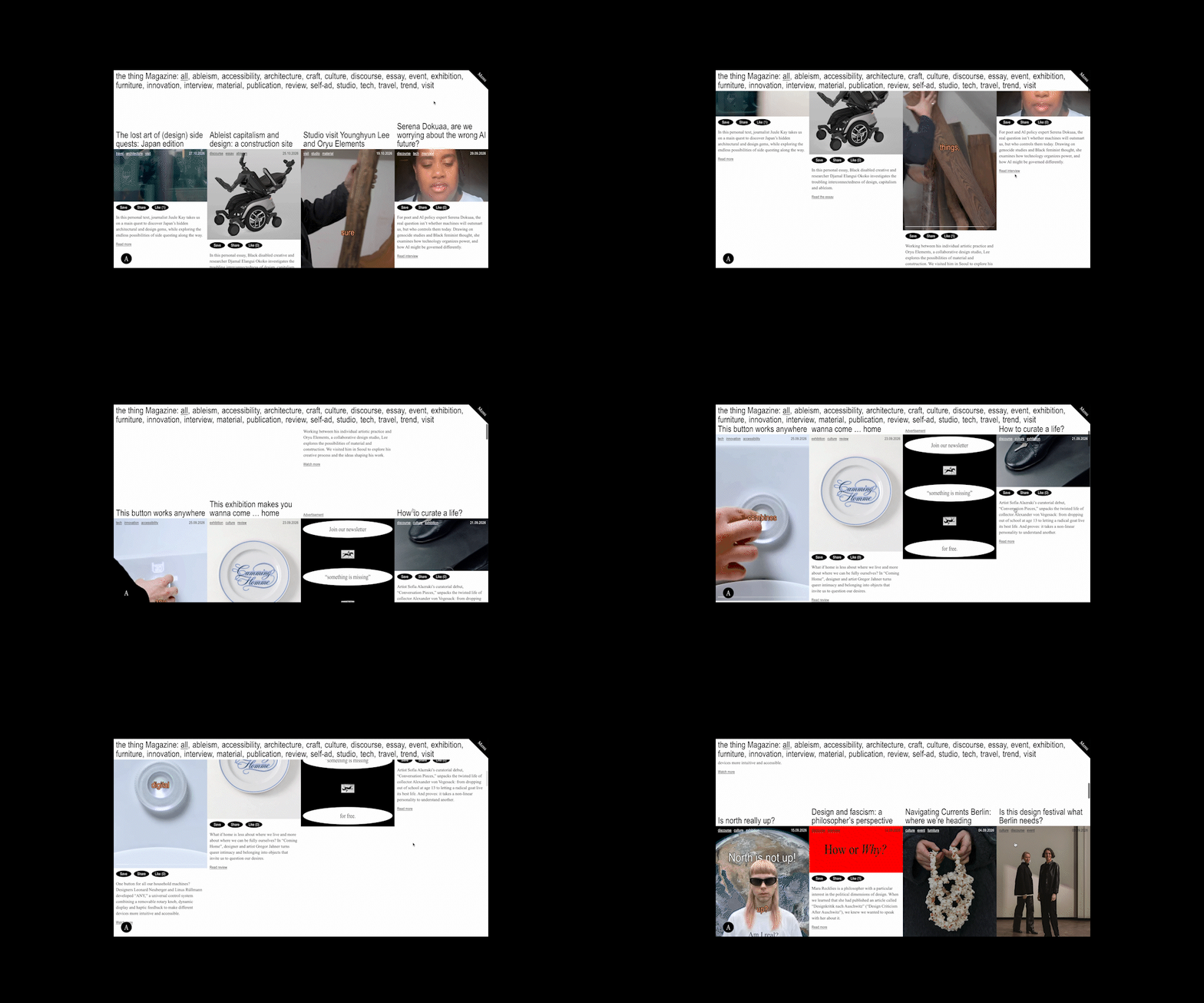
the thing Magazine was born on social media. Rather than denying that history, we wanted the website to acknowledge it while translating the experience into something that works in a browser. The result is essentially one long feed. So far, so familiar.
Bringing this idea to life was the task of Julian Priess, who developed the website and translated the design into a functioning platform. Especially with our ambitions around accessibility, independence, and a rather specific mix of content formats, this was not always as straightforward as the final result might suggest.
The landing page follows a simple grid-based structure, presenting our content in a continuous stream. There are no complicated categories (only tags) to navigate before you can start exploring. The hierarchy is deliberately straightforward: the most recent contribution comes first.
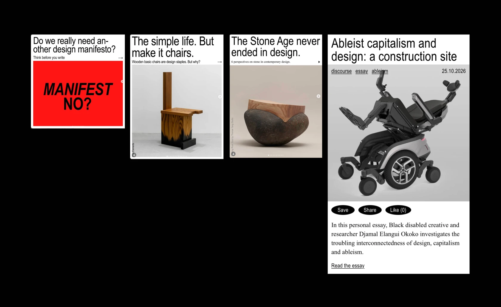
The evolution of the thing Magazine’s info posts: from the earliest layouts in 2023/24 to those adapted to Instagram’s vertical format in 2024/25, eventually forming the basis for how article previews are structured on the thing Magazine website.
Each article preview follows a recognisable structure, much like our informational Instagram posts: a headline, an image, and a short introduction. Clicking on an article opens it as an overlay, while each contribution retains its own URL, making it easy to share and revisit. The feed remains the underlying structure, even as you move into individual stories. Within those articles, however, the format becomes much more flexible. We also included the familiar options to share, comment, and even like articles. The latter is admittedly more of a gimmick than a serious feature, but why not?
And because vertical video has become an important part of how we communicate, we built a dedicated feed for it, too. Vertical videos appear alongside other contributions on the landing page. Once you click on one, a separate vertical feed opens, allowing you to browse all the videos published on the thing Magazine website.

Accessibility is a design decision
More interesting than the visual structure, however, is what happens behind it. We wanted the website to be accessible not only in the sense of being publicly available, but also in the way people actually use it. That starts with relatively simple design decisions. Clear visual hierarchies, consistent navigation, and buttons that describe what they do rather than relying exclusively on symbols. These might seem like small details, but they make a difference when a website needs to work for people with different abilities, devices, and levels of digital familiarity.
“We wanted the website to be accessible not only in the sense of being publicly available, but also in the way people actually use it. That starts with relatively simple design decisions.”
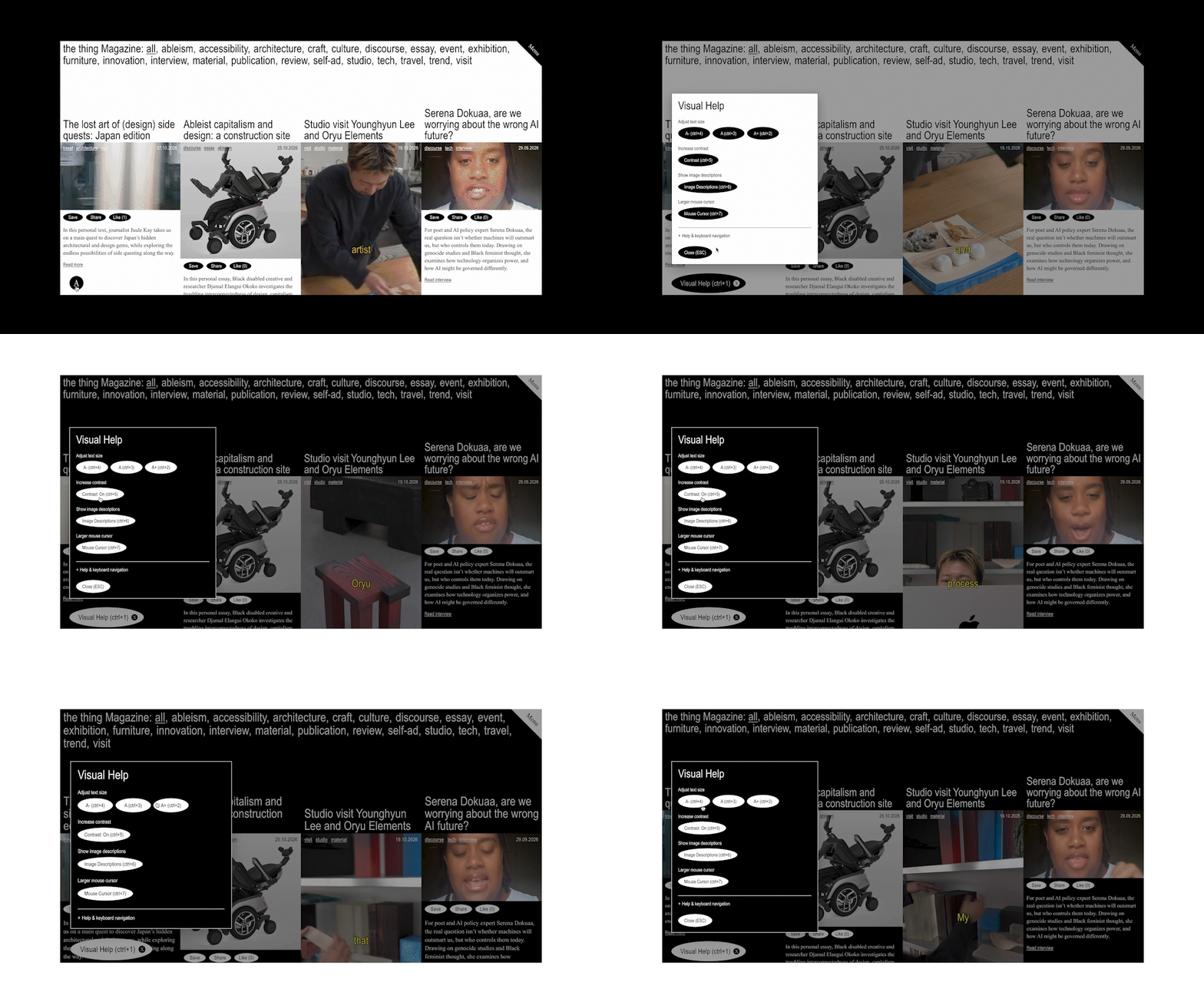
We also integrated accessibility tools that allow visitors to adjust font sizes and contrast settings, alongside support for image descriptions. The goal is to give people more control over how they experience our content, rather than assuming that one visual configuration works for everyone. Of course, accessibility is an ongoing process, and there is always room for improvement. Especially when you're operating with the budget of an independent magazine.
And then there is the question of infrastructure. Our website’s content is hosted on European servers, giving us greater control over where it lives and reducing our reliance on the large US-based platforms that dominate digital publishing. This doesn’t mean we have suddenly become completely independent of big tech. We still use external services, embed videos, and publish on social media. Digital sovereignty isn’t an on/off switch. But there is a fundamental difference between using a platform to distribute journalism and depending on that platform to make journalism accessible in the first place.
“Digital sovereignty isn’t an on/off switch.”
On our website, we decide what gets published and how it is presented, within the limits of applicable law. No algorithm needs to approve the subject matter before readers can find it. No platform-specific format determines how long a story can be or how many images it should contain. For a magazine that deals with design as a social, cultural, and political discipline, that freedom matters.
A place to store things
In the end, our new website is neither a technological revolution nor an attempt to reinvent digital publishing. It’s a relatively simple place to bring things together. But perhaps that’s exactly the point.
Designing for digital sovereignty doesn’t necessarily mean developing entirely new technologies or inventing unfamiliar interfaces. Sometimes it means questioning the structures we’ve become accustomed to. It means understanding that design isn’t just about how something looks, but also about who owns it, who can access it, and who gets to decide what appears there.
“Designing for digital sovereignty doesn’t necessarily mean developing entirely new technologies or inventing unfamiliar interfaces. Sometimes it means questioning the structures we’ve become accustomed to.”
The word magazine may have travelled a long way from its origins as a military storehouse. But we still like the idea of a place where things can be collected and discovered. And, ideally, a place where they can remain accessible without asking an algorithm for permission.
Welcome to the new the thing Magazine website!
Join our community to post comments.
Login
Create account
Recent Comments
No comments yet.